Rebranding, including product interface design, key touch points and purchasing experience of the Slovenian household appliance company Gorenje, with special focus on their ovens.

4 Master students

“To improve Gorenje’s identity by redesigning the brand, its different touchpoints and their products, focusing on their ovens”

In order to get to know the brand and understand where it comes from, a research and analysis was conducted around their origin and history, their values, the main channels where they meet their customers, and their products, specifically their ovens.
.svg)
brand story and values
.svg)
customer touch points
.svg)
product design
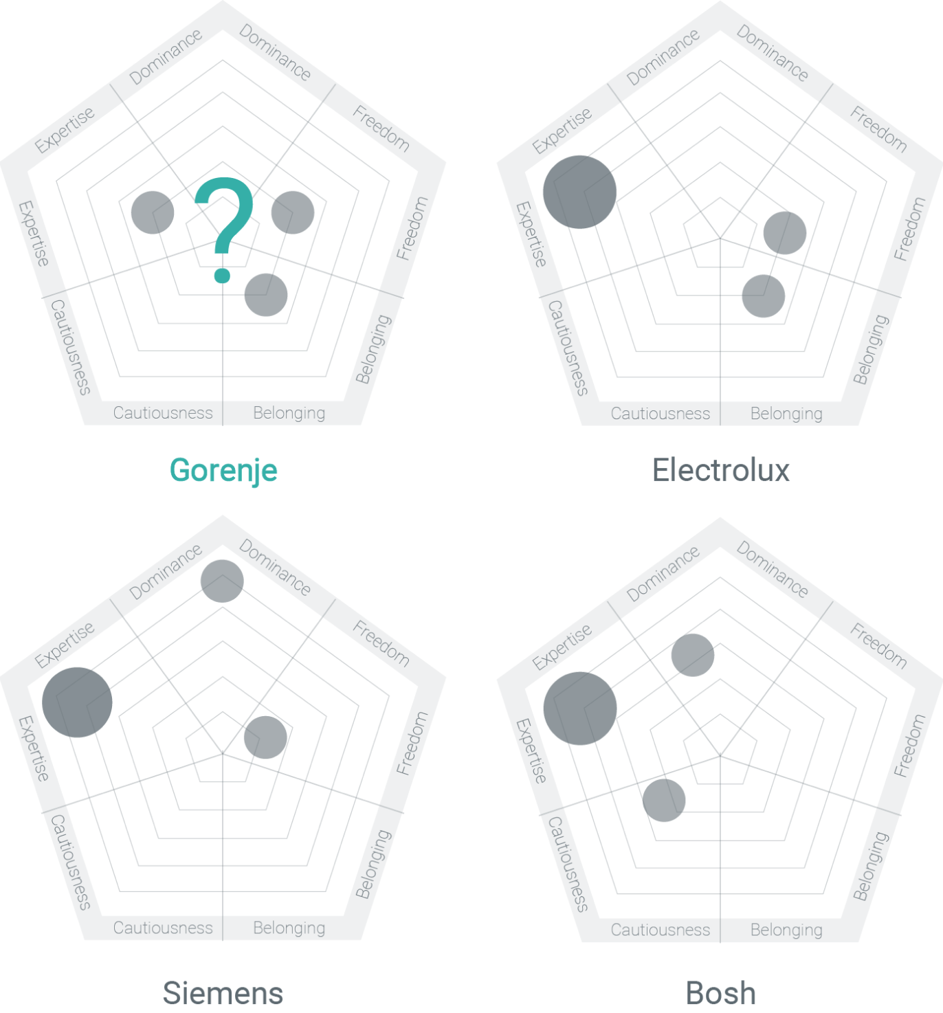
The brand was analyzed in order to identify what it stands for. But the results showed that there is no clear archetype and that it reflects different things throughout its touch points. The same analysis was done for its competitors to be able to find a unique stand among them.
An important touch point is Gorenje’s website, where the customers can choose and buy the appliances. After analyzing it we found that it was quite confusing, since it focus a lot on technical information and does not provide an easy to choose process.

No clear difference between products.
Very technical.
We also learned that the delivery was not handled by Gorenje, which we thought was a missed opportunity to be in closer contact with the customers and to offer them a great service experience.

When analyzing their products we found some inconsistencies in their design, including different displays and ways to interact with the ovens. We also found that some of their designs were cluttered and therefore confusing to use.
.png)
Design inconsistencies

Cluttered interfaces

In order to understand the whole purchasing and usage process the customer goes through, a journey map was created, including an early ideation of what the new Gorenje could improve in each step. Later, based on customer importance and improvement potential, three key touch points were identified, which were the base for the next steps.

Initial Journey map

Key touch points
To compile the results of the different analysis we created a chart that shows the connections/disconnections between the brand and the key touch points. We found out that the brand and its products have a good connection, but the online face and installation are lacking strong connections with the rest of the brand.


How might we create a more defined archetype that aligns with the brand values.
How might we improve the online face for a better user experience.
How might we make the product interface consistent with the brand.

In order to clarify the new brand direction, three main users were defined as the target group, on which the brand will focus on.

A mood board was created to be able to visualize the new direction we wanted for the brand.

Based on the analysis, and after an ideation session of the brand’s future, a set of new values were defined, together with a stronger archetype, which focuses on freedom.

New values

New archetype with focus on freedom

The oven selection on the website was re-designed, focusing on creating a simple user experience. To do that a simplified selection was designed where the type of oven is selected first and then it can be customized as a second step.

Step 1: Simple type selection

Step 2: Customization
To have more consistent products, we designed a new interface based on the logo’s shape, which would be the oven’s new face/identity, and which could be applied to different styles. We also added connectivity for a better usage experience and therefore we made a proposal of how the app could look like.

Interface based on logo’s shape

Different styles

Connectivity added, for a better user experience
Since the delivery is not handled by Gorenje we decided to focus on the un-boxing and first usage experience. The idea is that the first thing the customer sees is a card with Gorenje’s brand promise, then on the back a quick explanation of how to get started and a recipe of roasted almonds, together with some actual almonds, to try the new oven.
%201.jpg)
The oven is delivered with a present

Card with Gorenje’s promise

Back of the card with explanation of how to get started

...and a recipe for roasted almonds, to try out your new oven
.svg)

